This website is now archived. To find out what BERG did next, go to www.bergcloud.com.

Blog posts from December 2006

RFID Interim update

Last term during an interim crit, I saw the work my students had produced on the RFID icons brief I set some weeks ago. It was a good afternoon and we were lucky enough to have Timo Arnall from the Touch project and Younghee Jung from Nokia Japan join us and contribute to the discussion. All the students attending showed good work of a high standard, overall it was very rewarding.

I’ll write a more detailed discussion on the results of the work when the brief ends, but I suspect there may be more than I can fit into a single post, so I wanted to point at some of the work that has emerged so far.

All the work here is from Alex Jarvis and Mark Williams.

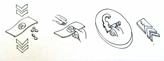
Alex began by looking at the physical act of swiping your phone or card over a reader. The symbol he developed was based on his observations of people slapping their Oyster wallets down as they pass through the gates on to the underground. Not a delicate, patient hover over the yellow disc, but a casual thud, expectant wait for the barrier to open, then a lurching acceleration through to the other side before the gates violently spasm shut.

RFID physical act 01

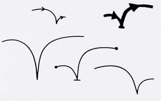
More developed sketches here…

RFID physical act 02

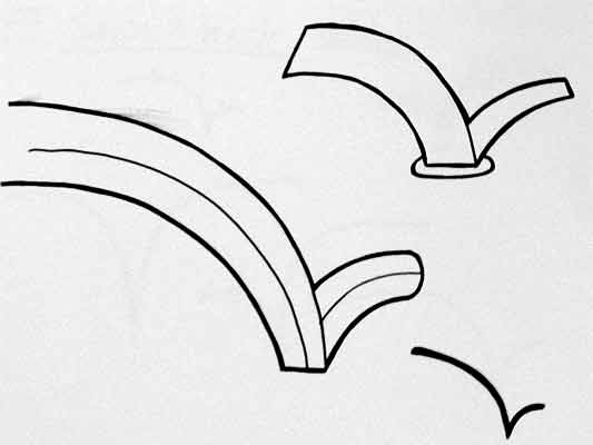
I suspect that this inverted tick will abstract really well, I like the thin line on the more developed version snapping the path of the card into 3D. It succeeds since it doesn’t worry too much about working as an instruction and concentrates more on a powerful cross-system icon to be consistently recognisable.

Verbs

The original brief required students to develop icons for the verbs: purchase, identify, enter (but one way), download, phone and destroy.

Purchase and destroy are the two of these verbs with the most far-reaching and less immediate consequences. The aspiration for this work is to make the interaction feel like a purchase, not a touch that triggers a purchase. This gives the interaction room to grow into the more complex ones that will be needed in the future.

This first sketch, on purchase, from Alex shows your stack of coins depleting, something nice about the dark black arrow which repeats as a feature throughout Alex’s developments.

RFID Purchase 01

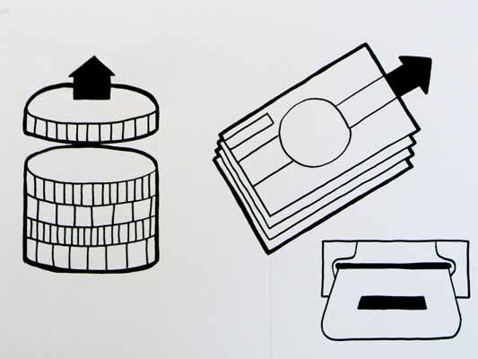
Mark has also been tackling purchase, his sketches tap into the currency symbols, again with a view to represent depletion. Such a blunt representation is attractive, it shouts “this will erode your currency!”

RFID Purchase 03

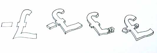
Mark explores some more on purchase here:

RFID Purchase 02

Purchase is really important. I can’t think of a system other than Oyster that takes your money so ambiguously. Most purchasing systems require you to enter pin numbers, sign things, swipe cards etc, all really clear unambiguous acts. All you have to do is wave at an Oyster reader and it costs you £2… maybe: The same act will open the barrier for free if you have a travel card on there. Granted, passengers have already made a purchase to put the money on the card, but if Transport for London do want to extend their system for use as a digital wallet they will need to tackle this ambiguity.

Both Mark and Alex produced material looking at the symbols to represent destroy, for instances where swiping the reader would obliterate data on it, or render it useless. This might also serve as a warning for areas where RFID tags were prone to damage.

RFID Destroy 01

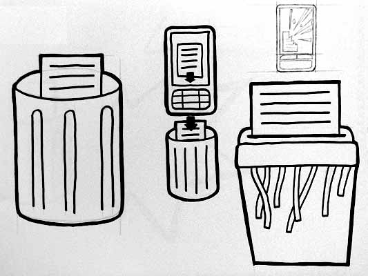
I like the pencil drawing to the top right that he didn’t take forward. I’ve adjusted the contrast over it to draw out some more detail. Important that he distinguished between representing the destruction of the object and the data or contents.

Williams Destroy sketches

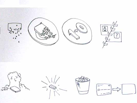
Mark’s sketches for destroy include the excellent mushroom cloud, but he also looks at an abstraction of data disassembly, almost looks like the individual bits of data are floating off into oblivion. Not completely successful since it also reminds me of broadcasting Wonka bars in Charlie and the Chocolate Factory and teleporting in Star Trek, but nice none the less.

Drawing

This is difficult to show online, but Alex works with a real pen, at scale. He is seeing the material he’s developing at the same size it will be read at. Each mark he makes he is seeing and responding to as he makes it.

Jarvis Pen

He has produced some material with Illustrator, but it lacked any of the impact his drawings brought to the icons. Drawing with a pen really helps avoid the Adobe poisoning that comes from Illustrator defaults and the complexities of working out of scale with the zoom tool (you can almost smell the 1pt line widths and the 4.2333 mm radius on the corners of the rounded rectangle tool). It forces him to choose every line and width and understand the success and failures that come with those choices. Illustrator does so much for you it barely leaves you with any unique agency at all.

It is interesting to compare the students’ two approaches. Alex works bluntly with bold weighty lines and stubby arrows portraying actual things moving or downloading. Mark tends towards more sophisticated representations and abstractions, and mini comic strips in a single icon. Lightness of touch and branching paths of exploration are his preference.

More to come from both students and I’ll also post some of my own efforts in this area.

Hello vod:pod

vod:pod is the newest video sharing and aggregator site on the block, and it has a few twists. Three of them:

First, the primary focus is a video collection (a pod) rather than a single one. Collecting can be done by individuals or together. So, for example, here are 4 people collecting indie music. You can scrub over the videos for a rank and rating preview before watching, and the sparkline at the top right gives you an idea of the popularity of the pod.

Second, VodPod lets you upload videos but doesn’t ask for an exclusive relationship. It reaches out into the Web–you can include videos from YouTube, Google Video, and so on in your pod, and keep all of them collected alongside your own ones. These highlighted pods all mix-and-match from different service.

Last is something Mark Hall just told me about: Each video has a low-threshold response widget next to it, so you can say quickly that you loved, just watched, or laughed at what you saw. If you add your Twitter details in your vod:pod profile, that response will also be announced to your Twitter buddies. Simple, social and (importantly) deliberate every time.

There’s a lot more to come – really big features – but I’ll leave it there.

vod:pod is the first service I’ve watched all the way from early concept through to launch. S&W did some very early product ideation and experience work – on how people find videos to watch online, as Mark discusses – and I’ve been following progress since. While the shape of the solution has changed considerably, the core values have been maintained: Organising, socialising, and being part of the Web.

I find that promising, and so vod:pod‘s what we use to host videos for this blog.

Immodesty and hello

We’ve had a bunch of extremely generous links in the past couple of weeks… just as we submerged into deadline mode.

Fimoculous picked out this blog, Pulse Laser, as one of the best blogs of 2006 that you (maybe) aren’t reading. Wow! I’ve had much teasing for being described as “the kind of nerd that all nerds aspire to be.” The other blogs in the list are brilliant; it’s extremely flattering to be placed in that company. Thank you!

And if that weren’t enough, we’re also in a list of Best Interaction Design Blogs 2006. Staggering company again, and thank you. Not bad for a blog that started only at the end of September.

Modesty, once thrown away, it difficult to re-establish. So I’ll continue.

There have also been a number of new readers coming from O’Reilly Radar on the 3C products essay series, and also from a great collection of lessons from animation (on 37signals) which links into one of those same essays.

America 1958

Hello!

What all of that means is there have been a lot of people visiting, with nothing fresh to read.

So, if you’re new here, start with our introductory post.

Then you might also enjoy our most popular posts (our top content to-date as listed by Google Analytics):

  • My printer, my social letterbox, on how taking the lessons of the Web to consumer electronics can make satisfying, simple, social products.
  • Burtin vs. Ellis/Williams compares a spread from Warren Ellis’ Desolation Jones to a page from a U.S. Army rifle disassembly manual. Comics are in everything.
  • Robot arms traverses from from extremely small, mechanical hands to industrial robot arms. Don’t miss the robot-arms-as-DJs link.
  • 3C products, The life of products and Experience hooks is a series about the new creative, connected and community-driven generation, Gen C. It introduces the 3C products they demand, and the design challenges we’ll face.
  • Visiting a model railway exhibition simply shows what we saw, models and layouts. The comments from model railway enthusiasts are of high value.

The image above, by the way, is from American Look (Part III) (1958). It’s a Chevrolet-sponsored film promoting the industry and style of the 1950; part III focuses on the designers themselves. This particular screen grab falls in the segment described:

15:15:20:00 MS Executives point to a model of car which is unveiled; smile and nod approvingly; senior executive shakes hand of subordinate, pats other on back

It somehow seems appropriate. The whole movie is recommended.

Making Senses revisited

Adaptive Path kindly invited me to their offices this morning, where I muddled through my Making Senses talk, on using the human senses as inspiration for next-generation Web browser functionality.

Optic flow

Revisiting the slides, and the conversation afterward, has shown me how to state the argument more directly:

  1. As far as interaction on the computer desktop and the Web goes, navigational and spatial metaphors dominate. On a micro level we talk about direct manipulation of files via icons: Dragging, moving, opening and so on. On a macro level, we have addresses, visiting, and sitemaps.
  2. When a person has navigated to something, they can know what it is because of the navigation itself. For instance, you know you’re in London because you followed all the signposts to London.
  3. In a world of cheap sensors, many, many display surfaces, and high connectivity, we are presented with information without that navigational context. Furthermore, in areas which have traditionally used the navigational metaphor (mainly the Web), navigation might not be the most appropriate approach to reading the news, buying books, or hanging out in chatrooms. Yet still we approach Web design armed with this metaphor.
  4. It’s as important that a thing can be instantly appreciated for what it is, as that it can be navigated to. ‘Instantly appreciate’ means comprehend pre-consciously, just as we instantly appreciate a chair as a chair when looking at it, without having to deliberately deduce the meaning of the pattern of light on our retina.
  5. As a guide to what qualities we should be able to instantly appreciate, we can use human and animal senses to show what features we need to recognise of things in the environment. Sensing these features is sufficient to let us intelligently interact, without navigating.
  6. To summarise these features, we need to be able to detect: Structure, focus and periphery, rhythms of activity, summaries, how this particular thing is situated in the larger environment (and more). The Web browser, as our sensory organs online, should do this job, instead of leaving it to the websites themselves.

Applying the sensory model to Web design triggers a few ideas:

  • The high-level structure of all sites should be represented by the browser in a consistent way, not by each site differently.
  • Regular patterns in browsing (such as the sites visited daily or weekly) should be supported by the browser.
  • Using the extracted keywords of a web page as its ‘scent,’ hyperlinks should indicate how their odour strengthens or detracts from the smell of the current browsing trail.

There are more ideas, but that’s what the presentation discusses and illustrates.

Incidentally, the image at the top of this post is from J. J. Gibson’s The Ecological Approach to Visual Perception, which talks about how we see continuously and actively as we move through space. I’d like to consider browsing the Web in the same light.

Recent Posts

Popular Tags