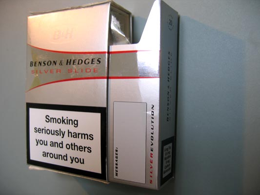
Since the comments on the Experience Hooks post were on unboxing, I thought I’d post about my current favourite packaging.
The following video shows a CD case then a cigarette packet, both opening in an unusual way. You also get to see my neck, and my Norwegian fishing jumper.
The CD, Peeping Tom (collaborations with Mike Patton), is just very cool. The action is unexpected, and the way the keyhole image changes is engaging. It’s the kind of thing you show your friends.
I’m more enamoured with the Benson & Hedges Silver Slide special edition pack. (I don’t smoke–I found this, empty, on a table in a pub.)

The pack understands that a large component of smoking cigarettes is gifting them to other people. There’s a lot of reciprocity wrapped up in that act: It can be used to develop an aura of generosity, or cashed-in immediately to get a hard-won conversation. See also: Teens and text messages in Alex Taylor’s paper The gift of the gab [PDF].
Silver Slide develops a story around that potent experience hook. Offering the cigarette, overlooked usually but now prominent because of novelty, becomes part of the experience. Really, you don’t need any remaining cigarettes.
My favourite touch: When you slide open the pack, there’s a space to write messages on the inner draw. That’s exactly what social smoking, especially with strangers, is about.

Taking something much more everyday, I’m also a fan of the squeezable Heinz Ketchup bottle (scroll down) launched a few years ago. Once upon a time, the ketchup bottle was a vehicle for carrying the product–that is, the sauce. Although the glass bottle was used in adverts as a feature, it was pretty tedious to use. The sauce came out slowly, and the rim of the bottle would get grubby. It was hard to clean. The move to a squeezy bottle recognised that the experience of consuming the ketchup was part of the product itself.
The squeezy bottle allows for quick and accurate application of sauce, and – the best feature – the bottle-top has no rim. It has a large, flat top, slightly curved. It’s extremely easy to clean, with a fluid wipe-round action. Because it’s easy, it’s done more often, and my overall experience of living with ketchup has become considerably less grubby. I’m sure grubbiness wasn’t something with which Heinz wanted to be associated.
A previously unpleasant uncatered-for activity intrinsic to the delivery of ketchup has become part of the design. Who knows whether ease-of-cleaning was a factor in the squeezy bottle shift… I’d like to think it was.
9 Comments and Trackbacks
1. mac said on 30 November 2006...
o2 xda box works in a similar way
http://www.catapultdigital.com/mac/xdabox.mp4
2. mac said on 30 November 2006...
http://www.flickr.com/photos/cmmorrison/sets/72157594398863758/
is some packaging i did for pencils – reusable as a pencil case, it had an integrated pos element.
the neat bit was as you slide the two sides apart to open it the middle section rises up.
3. Matt said on 30 November 2006...
That o2 box is gorgeous. The fold-out segment is particularly good. I recently got a PSP (a raffle) and was totally disappointed by the packaging. Loads of bits stuffed into the box, no magic moment of lifting the PSP out, no clues about what’s important and what’s not. Not how you want to be rewarded if you actually pay for the thing.
4. jeff said on 4 December 2006...
To my awareness, the peeping tom case is a custom variation on the burgopak(.com). I’ve wanted a reason to use them for 3 years or so, alas :/
5. tom a said on 5 December 2006...
Matt – I should probably show the packaging for an XBox 360 at some point. It’s rather nice – big, weight box with a handle, and the lid opens like a big swing-door. Once open, it’s full of green and orange bags, and some separate panels (not brown, but full colour).
What I really liked is that all the bags have subtle detail – the texture on them is, in fact, a multi-lingual description of them. So the microphone is in a bag covered in “talk” in many languages, the PSU in a bag saying “power”, the console in a bag saying “play”. There’s SO MUCH in the premium box – console, PSU, headset, controller, network lead, composite lead, component lead, scart adapter, hard disk – that the labelled bags act as a nice distinguishing touch. I was very impressed (as I am by the whole console).
Shame it was so heavy carrying it home on the bus…
6. v said on 10 December 2006...
Is this packaging design? (Check out the videos)
http://www.dbfletcher.com/capstan/
7. Timo said on 11 December 2006...
You should probably also refer to the work of Ben Hopson:
“Investigating the different ways that movement can be designed. While designers have numerous techniques and tools at their disposal to improve the appearance of objects, when it comes to creating ways for objects to move through space…”
http://www.benhopson.com/index.html
8. robertogreco said on 12 December 2006...
Steve Jobs (not really) on the importance of packaging…
“So what’s the hold-up? Well, it’s packaging. Here at Apple we don’t just put something in a box and ship it. We put as much thought, maybe more, into the packaging of the product as we do into the product itself. What we’re looking to achieve is this magical sequence that takes place when you open the box.”
http://fakesteve.blogspot.com/2006/12/regarding-our-iphone.html
9. matthew said on 15 December 2006...
its interesting how much cigarette manafacturers are playing with their packaging design these days. i’ve noticed a number of variations on the bog standard packet recently. i guess they’re spending their left over money which they used to spend on advertising