Earlier in our involvement with Touch, Timo and I held a workshop with Alex Jarvis (currently at moo.com) and Mark Williams (now at Venture Three) to explore notation for RFID and the actions hidden in the readers.
One of my favourites that emerged from the day was this one.
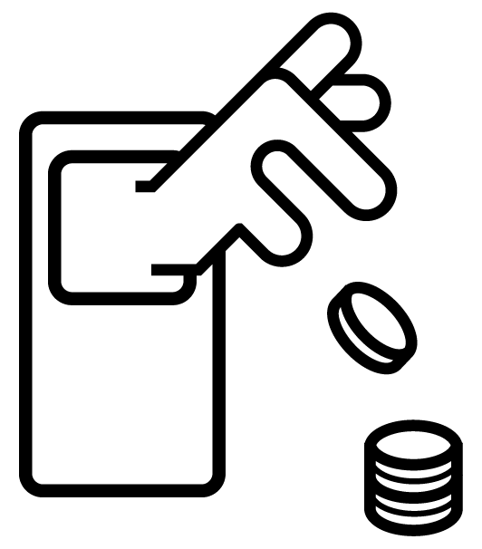
It shows how far we were reaching for metaphorical handles – around which to characterise the technology, relying on the verbs associated with the result of the interaction: to Pay, to Open, to Delete etc.
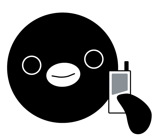
Physically the systems are very different and are more frequently represented by their envelope packaging, like the Oyster card. Branded systems have chosen to use characters, my favourite is the Suica Penguin.
During the visualisation work, the cross sections in the readable volumes that emerged began to feel very strong visually. They capture an essential nature in the technology which is difficult to unearth with symbols based on metaphors.

Timo and I experimented with forms which have an almost typographic nature ranging to a more strictly geometric shape.
![]()
We settled on this most geometric version. It would be terrific to see this picked up and used as a symbol for the technology in public.
![]()
A CC licensed pdf of the ‘geometric’ can be found in the Touch vaults.
4 Comments and Trackbacks
1. Lee Maguire said on 19 October 2009...
Great stuff, and good to see a CC licensed image.
One little quibble, though. You’ve used the Attribution license without specifying acceptable forms of attribution. For something that might work as a universal indicia of RFID-tech there may be many occasions in which a normal textual attribution would seem impracticable.
Such as, and I admit this was my first thought, some RFID version of a “Green Lantern” ring. Or tags in clothing, or smaller.
“Attribution — You must attribute the work in the manner specified by the author or licensor (but not in any way that suggests that they endorse you or your use of the work).”
2. ben barker said on 19 October 2009...
Yeah, really like this. Viewing this video in combination with the nearness video feels like a really succinct yet artful appreciation of the technology. Great stuff, nice outcome too.
3. Auke van Scheltinga said on 27 October 2009...
eum, guys… human centered design. This icon doesn’t communicate anything. How many grandma’s at the train station looked at this and thought: a great! there is my RFID sensor so I can pay for my ride. Or did you design this icon to help engineers communicate about RFID?
Trackback: RFID icon based on Immaterials 19 October 2009
[…] Schulze has written up some thoughts on the new RFID icon based on our Immaterials’ visualisation work from last […]