Movement
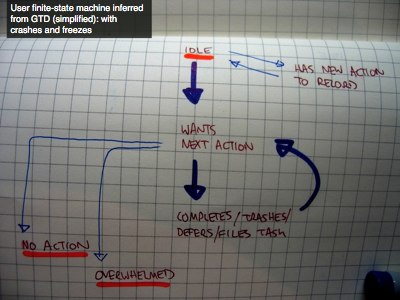
Of course, sometimes when the user asks for a next action, there’s nothing for them to do. Or worse, there are so many things for them to do that they’re completely overwhelmed.
I’ve underlined, in orange, these potential crash and freeze states. Both are different types of halting state, but one is where it all blows up, and the other is where the machine runs out of things to do.
Let me be more concrete about what halting states are. Think about my radio. The problem with a radio is that when you turn it off, there’s no necessary motivation to turn it back on again. This is potentially dead-end state: a frozen state.
So what I could do instead is not have an off button. I’d have a “go to sleep for 20 hours” button. And even while it was off, it would be making subtle recommendations for programmes the listener could tune into. Anything to break out of that freeze.
So now we have a new design challenge:
First: We have to try to avoid the user ever getting into these states. So we need to make sure they’re continuing to add tasks, do there’s always something to do. And we need to watch out for the task list getting too long, so they don’t feel overwhelmed. Task triage is really good for this, where you can help the user pick off all the two minute tasks on their list.
So that’s preventative measures. But you can never completely stop users entering these states.
So the second challenge is to help them find ways out of these states. I’ve talked about how to exit idle. Here, most critically, we need to find ways to help people exit the overwhelmed state. One good way is to help people declare todo list bankruptcy, just to throw away the whole list and start again.
Once we’re looking at it from this user state machine perspective, we see that it’s not the doing of tasks that matters, it’s that the user is performing as the machine at all!
