The Experience Stack
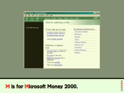
Where Levittown houses are about “limited functionality” to start, Microsoft Money 2000 introduced a “tight narrative” idea they called the inductive user interface.
Where they were coming from was the idea of the application as data with manipulation tools. This is very good for Excel. but for Microsoft Money, that’s not so appropriate. looking after your budget isn’t a smooth landscape of possibility—it’s one of definite tasks, particular actions need to be done sequentially or at particular times. The interface, said the designers, should do more of the work.
Given they explicitly say, in their 2001 article about the inductive user interface, they’re taking their cues from the web, it’s worth looking at their premise and process.
The premise is this, and I quote: “a screen with a single, clearly stated, explicit purpose is easier to understand than a page without such a purpose.”
And then the process is to focus each screen on a single task; state the task explicitly; change the screen to suit the task; then offer links to secondary tasks.
This doesn’t seem so remarkable now we’ve had web apps for 8 years, but at the time they were come from a desktop GUI world of drag and drop and direct manipulation and so on. It’s well thought out, and I highly recommend giving the paper a read.