Mag+ is an approach for bringing paper magazines to digital media, with a special focus on touchscreen tablets.
BERG were approached by Bonnier R&D in October 2009 to help concept and prototype digital magazines for the then-forthcoming next-generation of digital media tablets.
The goal was to create something as satisfying as their paper forebears, which research reveals possess an extraordinary degree of engagement and attachment amongst all other media.
We created a conceptual prototype in video that was made public in December 2009, and with the announcement of the Apple iPad on the 27th January 2010, we begun a rapid implementation of the concept – resulting in the first magazine on the Mag+ platform, (Popular Science, as PopSci+) being available in Apple’s AppStore for the US-launch of the iPad just over two months later on 3rd April, 2010
Bonnier developed a set of experience principles from their research, which formed the basis of our brief as we workshopped concepts with them at their Stockholm headquarters.
Amongst them:
- Magazines are amongst the few “mono-task” mediums. They create “Time for me”. Preserve this with a “Silent mode” – no distractions.
- Clearly defined beginning and end. A product delivered in a stable, completable issue format.
- Aim for gorgeous, fluid motion.
- Provide a comfortable screen-reading experience for deep-dives into content.
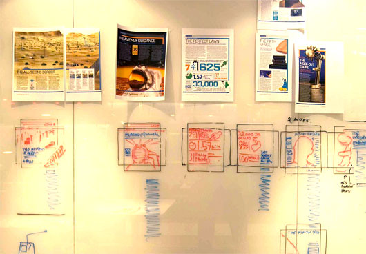
Material exploration of a wide range of Bonnier’s magazine content in conjunction with their experience principles as a frame led to initial sketches and video sketches. We developed a number of different initial approaches to the reading experience – such as the following experiment, where a long-form magazine article is deconstructed into a serial experience for ease of reading on a small screen.
This was very fast, low-fidelity sketching to interrogate the various intuitions we had. We literally taped the pieces of magazine together in a line, hung them from a door frame and then videoed it with an Apple iPhone, which then we viewed the results on – to get a very, very rough feel of what it might feel like on a hand-held device.
From these more high-level strategic design ideas, we developed the interaction design concepts using video prototypes: motion graphics and live-action film based on gesture-based interaction ideas that could be critiqued as believable near-future media artifacts.
Video prototyping in this way also reveals much about the acceptable timings and rhythms of interactions – allowing tuning of the experience that would become invaluable in the later realisation of the project.
Capturing the live-action footage of a model – based on our best-guess dimensions at the time for forthcoming digital tablets – also led to insights about physical interactions.
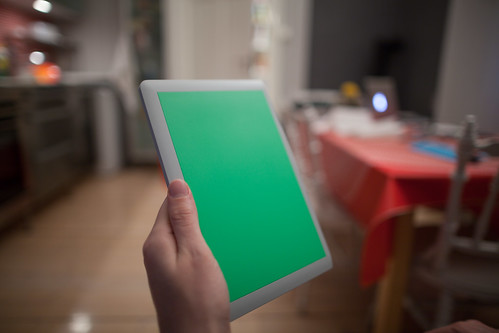
Insights about the form-factor of the device, the fatigue that certain gestures would create over prolonged use, what generally was most comfortable in terms of both using the device and the social context of using a ‘glowing rectangle’ rather than a paper magazine…
Bonnier R&D released the video prototype on the public web in mid-December 2010, and got a great deal of feedback. The video has been viewed over 475,000 times at Vimeo alone at time of writing.
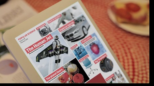
Press and public response to the prototype was very favourable, Bonnier generally being seen as leading the pack of announcements and concepts made public at the time.
“The digital magazine battle royale has gone up a notch today, with the publishers of Popular Science magazine creating this beautifully graceful concept…”
“Mag+ digital magazine concept makes e-readers cower with envy.”
“Bonnier’s video prototype looks stunning.”
“The Bonnier approach shows real promise.”
After the first stage of the project culminated in the public video prototype, BERG moved onto looking at service design aspects of delivering the digital magazine experience, but the announcement by Apple of the iPad device at the end of January 2010 saw us called upon by Bonnier to rapidly make the concepts in the video a reality.
With 54 days on the clock till the launch of the iPad, the goal was to have the April issue of Popular Science available on the very same day.
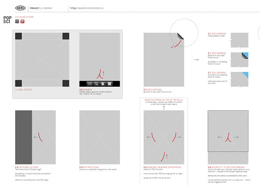
Close collaboration with the magazine’s editorial staff, enabled us to create a set of ‘grammars’ that would translate static printed page layouts into iPad equivalents that resembled the original, but would be enhanced by the new medium.
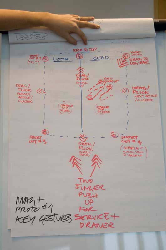
We formalised the interactions we had conceived in the video prototype into a ‘gesture map’ that would feel as natural and intuitive as possible.
Quickly we started to build out on Apple’s iPad simulator – while also working on scripts and server-side tools that would take the magazine content as produced for print and translate it into material ready to be re-rendered by the Mag+ reader app.
We built an authoring system that understands work-flow, a set of tools for InDesign integration and an e-commerce back-end capable of handling business models suitable for magazines. At the centre of this is a new file format, “MIB,” that strikes the balance between being simple enough for anyone to implement, and expressive enough to let the typography, pictures, and layout shine.
PopSci+ launched with the iPad in early April, and will soon be joined by a number of other Bonnier magazines. Steve Jobs called it out as ‘King of the Hill’ during one of his famed keynote presentations, and it was subject to an in-depth feature on Apple.com.
Mag+ live with Popular Science+ from Bonnier on Vimeo.
Mag+ made use of BERG’s abilities from strategic design thinking about new media, to rapid prototyping and full service execution. It’s one of the fullest, and most satisfying media design briefs that the studio has explored.
