An investigation into various concepts of attention, culminating in a functional product prototype to address the issues raised by CPA and the present-day interactions around Nokia mobiles.
As one of their Summer Stimulus projects in 2005, run to inform Nokia’s design strategy, Matt Jones briefed us to look into “Continuous Partial Attention” (CPA) and the mobile phone. We presented an investigation into the various concepts of attention, and a functional product prototype to address the issues raised by CPA and the present-day interactions around Nokia mobiles.
Project description and extracts of research published with permission.
Initial investigations
Building up to Linda Stone’s Continuous Partial Attention (for more, see the Supernova 2005 address on attention), we examined the various uses and metaphors of “attention”:
- in psychology, with background awareness and focus
- as a commodity, or as a place
- as the Attention Economy (everything from anti-spam to celebrity)
Using CPA itself as a springboard, we looked at how the mobile phone contributed to rapid transfer of attention, and connectedness addiction. Considering the mobile phone as a physical thing led us to examine its social visibility, the idea of telepresence, and how calls (of various types) fit into daily life.
Finally we decided to assist management of CPA, rather than challenge it, and draw on the psychological phenomenon of change blindness as a signal that avoids grabbing attention (Matt’s work on Mind Hacks was in play here).

Prototype
After presenting a number of concepts, including some which would lead to physical products, Matt Jones chose one with which we should proceed.
Recognising that email clients, calendars and mobile phones made a number of demands on our attention, but always used an interrupting alarm that didn’t take account of our level of busyness, we set out to create an office installation which would, in the spirit of Mark Weiser’s Calm Technology:
- Provide an at-a-glance view of pending items, with more detail if you look closer
- Make use of change blindness to avoid instant interruption, yet still be informative if you’re looking out for new alerts
- Be “sufficiently normal” to avoid the common problem with physical installations, which is that their rarity means they stand out and don’t work as background awareness indications
The prototype we created, called Attention Fader, is intended as decoration in a small office. Adam Greenfield discusses our project in his book Everyware [at Amazon] and provides this introduction:
It’s a framed picture, the kind of thing you might find hanging on the side wall of an office cubicle,
that appears at first glance to be a rather banal and uninflected portrait of a building along the south bank of the
Thames.
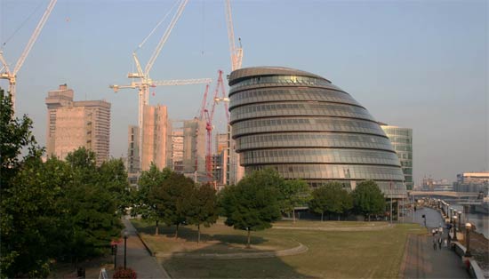
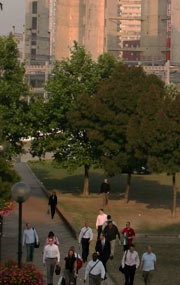
While the picture on the wall is static, its features are changing to represent demands on your attention. Greenfield continues: “Leave town for a few days, let your in-box fill up, and the number of people gaggling on the river path will slowly mount.”
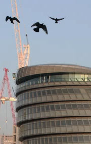
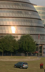
There are also cars on the lawn, birds circling in the air, and bright reflections on the glass building. Each of these parameters has multiple levels.



Greenfield finishes his description: “None of the crowds or trucks or birds are animated; they fade into the scene with such tact that it’s difficult to say just when they arrive. It’s precisely the image’s apparent banality which is key to its success as a peripheral interface; it’s neither loud, nor colorful, nor attention-grabbing in any obvious way. It is, rather, the kind of thing you glance up at from time to time, half-consciously, to let its message seep into your awareness. For that matter, those who saw the picture at infrequent intervals – cleaning staff, visiting guests – mightn’t notice anything but a London street scene.”
Experience
During testing, I (Matt) had the crowds on the right of the building represent an inbox barometer: The crowd would be larger if the number of emails in my inbox was greater than 24 hours before. The crowd would only disappear if the number of emails decreased. Since an absent crowd is a stand-out feature, the “normal” level should be a small number of people.
At the end of the time, I found myself working to decrease the size of my inbox—not just keep up with today’s emails. Representations of state are never merely representations. We use them to reveal and monitor aspects of our own behaviour, and once revealed we are able to have more control. The attention monitoring system let me engage in active management.
Technically
Photos and photo segments are montaged on-the-fly by an application written in MaxMSP—the prototype runs on a computer rather than in a standalone frame. MaxMSP is suitable for interactive video composition, and we use it together with external control scripts which talk to other applications on the computer or, feasibly, to a paired mobile phone.
Project
This short project included an initial brief, research, alternative concepts, and a final presentation of research and the prototype. We find that, in design research, prototypes successfully stimulate ideas for our clients. In this case, it provided a touchstone to discuss the demands of communication and a way to think away from the conventional—but possibly not optimal—ways that devices structure these interactions.