I’ve been invited to speak on a product-design panel with the theme of “Display”, alongside Martin Blum of Black-Blum, Miles Hawley + Diane Fox-Hill of 1HQ
and Matthew Cockerill of SeymourPowell.
Nick and Lei are working on the next version of the app, and on scaling up. James is working on the authoring tools, aided by Loz and Simon who are making it easier for first-time users and laying the foundations for better InDesign integration. Campbell is our production expert, both helping James and answering queries from a few different magazine production teams. Together with Jack and Matt J, he’s also designing features for the version after next.
Schooloscope moves towards its second feature release! Tom’s working on that, while Matt B works on designs for the planned third release. Kari is replying to queries and feedback. Ben is helping us with data. (Here’s the Guardian’s write-up of Schooloscope.)
Both Mag+ and Schooloscope are now in operations. Ops is pretty new to us, and the continuous involvement it requires doesn’t play well with the clear open space you need for free inventive work. We’re using Tender for a helpdesk, and Codebase to track bugs and allocate features to releases.
Trumbull is working towards demo: that’s Matt B, Paul and Matt J.
Jack and Matt J were in Amsterdam last week with Layar.
Andy continues working towards end-to-end demo for Weminuche. He’ll rope Tom in this week. Jack continues working with electrical engineers on Availabot. A previously unnoticed requirement about USB power draw led to a small design change, which led to a bigger opportunity to simplify the bill of materials, which had an impact on the industrial design. It’s utterly fascinating how all the different bits link together.
The last few months have been so busy. I completely underestimated the real impact of “Scenario 4.” (In short: it was that everyone’s been too busy to even think.)
But the nice situation now is that, with our capacity slowly coming back over the next month or two, we have the chance to speak with prospective new clients in a considered and practical way. So: lots of having coffee with people. Good good.
Project Kendrick is in the world! As Matt Webb mentioned before, it’s a new iPhone app for language learning we produced with our friends at Hodder Education, and is the latest addition to a best-selling range of language learning products called the Michel Thomas Method.
Michel Thomas was a celebrity linguist with an amazing life story. Escaping from concentration camps during the Second World War; tortured by the Gestapo; teacher of celebrities such as Doris Day, Woody Allen and Barbara Streisand — it even says his “last known identity” was that of Michel Thomas. Awesome. What a brief to work with. I’ll come back to him in a sec. Here’s a little clip of the finished app in action:
The mighty Nick Ludlam and I brewed it up together, with direction, input and advice from the rest of the BERG crew. And I’d like to tell you a little about the behind-the-scenes stuff — the craft of making and thinking — that went into it.
Kick-off
Nick and I began the main building work late last year. As you can imagine, we had a brilliant brief to work with. Schulze, Webb and Jones presented us with a huge swathe of thinking. The big-picture strategic vision; the sites, situations and contexts these apps could find themselves in (“can we make this as useful for 30 seconds on the bus as it would be for 30 minutes of concentrated listening at home?”); even little napkin sketches of UI details. All gourmet brainfood. Now all we had to do was get it into the world.
The Learning Room: beautiful, ambient, immersive
One of the first things that struck us (and probably you, if you’ve ever tried one of the CD box sets) was Michel Thomas’ voice. It’s utterly captivating, and can feel quite hypnotic at times. Have a listen again, without the visuals:
Immediately, we all agreed that whatever user interface we came up with would have to complement — even celebrate — this listening and learning experience without getting in the way. The idea of a ‘Learning Room’ quickly emerged — somewhere ambient, immersive, and hypnotic, where you could concentrate for substantial lengths of time without getting bored or distracted. And of course it would have to be a pleasure to use. Matt Jones came up with a cracker of a challenge by asking us to “Make The Best Pause Button In The World.” Brilliant.
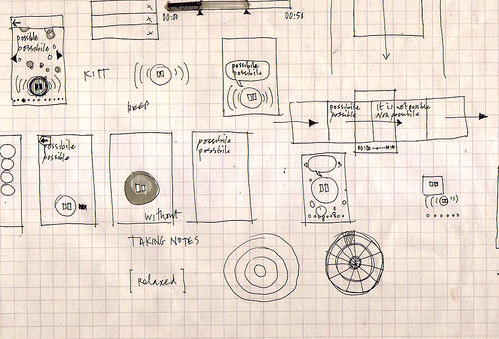
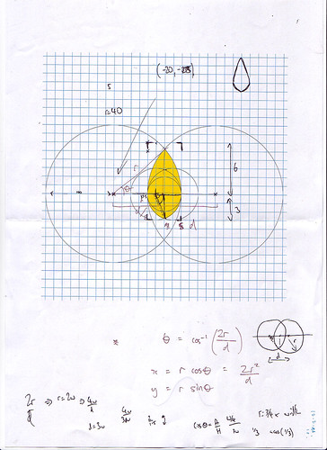
Here, I was doing some drawing while listening to Michel Thomas’ voice for the very first time. Looking back, this one pretty much laid the foundations for the next few months’ work.
Look at the notes. KITT from Knight Rider immediately came to mind. A talking play/pause button. Products as People, I guess. And it’s interesting that those little geometric doodles started to happen straight away as well. I imagine there’s a really primal link between hearing sound and seeing patterns, and this was probably something I hoped we would touch on later.
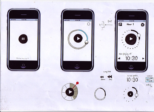
Immediately after the first drawing, I put together a little animated sketch of how the Best Pause Button In The World might work.
The main goal here was for me to do just enough to describe the idea, so that Nick could take it and iterate it in code. He’d then show me what he’d built; I’d do drawings or further animations on top of it, and so on and so on. It’s a fantastic way of working. Before long, you start finishing each others’ sentences. Both of us were able to forget about distinguishing between design and code, and just get on with thinking through making together. It’s brilliant when that happens.
Then we tried this. A kind of pastoral landscape with a floating, talking pause button. And speech bubbles. Too much.
And then an idea about using generated bokeh effects and imperceptible zoom effect that never reaches a climax. Too strange.
Here, we were exploring how to use animation and interactivity in a small portion of the screen (to save precious processing power), and make it seem to be operating in a bigger space than it actually was.
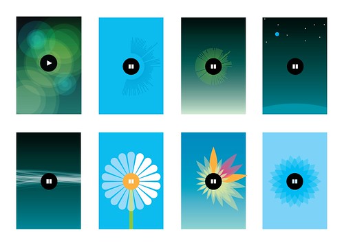
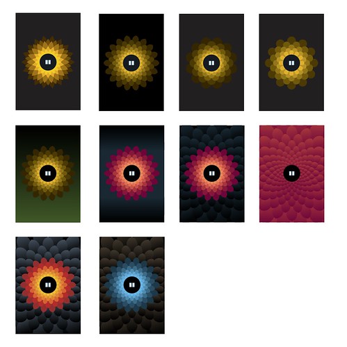
Originally, we wanted to use a pond-like rippling effect (that one below on the left), but it turns out drawing transparent, overlapping filled circles, as well as streaming audio and animating the pause button, took too much juice. The little blue flower at bottom right was the first step toward the final design.
Here we developed the little blue flower, adding texture and depth to give it a bit of tactility.
And here’s how you draw a procedural petal.
The pause state was really important to get right too. Here you can see us getting a bit too Bang & Olufsen before dialling it back to something more approachable, shiny and Apple-y.
And of course this is where we ended up:
Materials and tuning
Every so often we’d catch ourselves talking solemnly and straight-faced about some detail involved in building the Learning Room. Then we’d take a step back. “Dude. It’s a talking flower. How the hell did we end up here?” Looking back, there’s no real process or rationale I could outline. It’s a product of many things — our personalities, references to things we like; doodling; tinkering; sketching; prototyping and so on. But, overall, it was born from the material itself.
How much CPU did we have left after streaming audio and making the pause button animate in response to Michel Thomas voice? Not much, it turns out. We spent a lunch hour thinking and drawing, came up with thirty-odd ideas, tried a few of them out, and the flower ended up sticking around, for a few reasons: Nick could draw it procedurally in code; animate it efficiently at a decent frame rate; the symmetrical, primal pattern looked striking; the visuals adapt to different languages; the flower scales down to icon size nicely, and most of all, using it feels completely unique, yet strangely appropriate. Our friends from Hodder were closely involved right the way through, and ultimately, it was their faith in this design-led approach that allowed us to get these ideas into the world and into your hand.
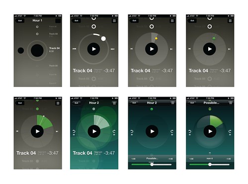
Overall, I’d say the whole UI — from the Learning Room, to the Store, to the Flashcards — went through five or six complete iterations before we settled on something that felt simple and smooth enough for a release. Then, we tuned, tuned and tuned. Matt Jones has talked about Disney’s idea of plussing before, and again I don’t think it’s possible to describe it as a discrete thing. It just seems to happen when you really get a feel for the material (or rather immaterial) you’re working with. You develop a laser-like focus on ‘rightness’, and devote yourself to getting rid of anything that doesn’t make the experience as delightful as possible.
It’s been a brilliant product to work on, and hopefully it’ll help more people discover the strange, hypnotic magic of the Michel Thomas Method. Why not give it a try? – we’d love to know what you think of it.
When the Michel Thomas Method language course CDs arrived at the studio, we played them on the stereo immediately. But the post was late so it arrived only the day before we were due to speak with the publishers. We tore up all our ideas and started again.
Michel Thomas teaches with no homework and no repetition. Listening to him, it’s a little like being in a classroom with other students and a little like being hypnotised.
You don’t learn, you flow.
As a design studio, we knew we had to carry the same experience onto the phone, using just the regular audio and a decent respect for the philosophy.
You can learn French, Spanish, Italian and German. It’s free to get the app (you get a preview of each language), and then you buy hour-by-hour as you improve.
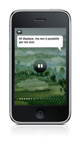
In the flesh, the screen on the right is animated. It draws you in as you listen to the voice.
Do a pulsating pause button and tactile flower petals have a place in an audio language course app? Yes. (You have to hear Michel to understand why. I’m not kidding.)
Because mobile phones are, well, mobile, you might want to keep that learning flow going while you’re on the bus. So there’s a flashcard game. You can play one of dozens of preset decks, or make your own from favourite phrases.
This one is from the Spanish course.
There’s also the shop. I like that the “pay as you learn” store is in the exact same place as where you thumb through the course contents. I think we went through 4 iterations until it felt this smooth.
Work in the popular market, and be inventive, beautiful.
Respect the materials. I believe with Michel Thomas we’ve taken what’s best about the experience and made a hybrid with what’s best about the iPhone. We’re best when we partner with people who are just working out what they want to do, and we can discover together.
But what I’m proudest about is that this is a design-led product in a commercial marketplace. This isn’t just for Michel Thomas fans (though there are many). By bringing the feeling of Michel to the iPhone, his courses can find a whole new audience, and a whole load more fans.
Congratulations to the team, Matt Brown, Nick Ludlam, and Matt Jones! Thanks also to Guy Moorhouse for the microsite. And, especially, thanks to Vivian and Helen and the whole Hodder team. It has been a pleasure.
I’ve been keen to post it as it’s a pile of ‘beginnings’, rather than a self-contained thought.
It’s a bunch of thinking about how designers (and BERG in particular) might start thinking through making products for ‘smart cities’ (as they’re known for good and for ill) including the qualities that these products should possess in order for them to be invited into people’s homes – something we’ve started calling ‘mujicomp’ as shorthand in the studio.
Also it talks a little bit about how the aggregation and combination of smart, connected products could build into bottom-up infrastructures rather than giant top-down municipal approaches to augmenting cities with technology.
Specifically, looking at doorways and thresholds as rich places to investigate with products and services – something which at the summit we called with-tongue-firmly-in-cheek ‘Porch-Computing’…
The studio is nice and full and humming and buzzing and it’s a great place to be, but gosh, we’ve been busy. And being busy working on projects – like Schooloscope, launched in beta this week – means there hasn’t been as much time for writing as normal.
Even if posts don’t make it to the blog, though, there’s a steady hum on the internal studio mailing lists – bursts of banter, links to curios dredged up from around the internet – and all good fodder for a post full of videos after a quiet period. Time to start clearing that backlog.
Campbell found this delight – the winner of the “Best Visual Illusion of the Year Contest” 2010. It’s brilliant, and the reveal is obvious and uncanny all at once:
Each week, we like to begin and end our Tuesday morning all-hands meeting with a piece of theme music. Matt B and Matt J tend to take the lead there, and this week, Matt J picked “La Serenissima” by Rondo Veneziano – which can’t really be experienced without its surreal animated video:
The lovely stop-motion video for Cornelius’ “Fit Song” came up in conversation one afternoon:
Last week, Matt W tried to explain the magic of the Enchanted Tiki Room at Disneyland, and eventually found us a video of it:
It’s now quite a while since the skies went quiet under the threat of volcanic ash. I loved this animation, based on data from flightradar24.com, showing just how quiet European airspace went for a week.
And that’s a full slate, I think. Have a lovely weekend.
Schooloscope is a new project from BERG, and I want to show it to you.
What if a school could speak to you, and tell you how it’s doing? “I have happy kids,” it might say. “Their exams results are great.”
Schools in England are inspected by a body called Ofsted. Their reports are detailed and fair — Ofsted is not run by the government of the day, but directly by Parliament. And kids in schools are tracked by the government department DCSF. They publish everything from exam results to statistical measurements of improvement over the school careers of the pupils.
Cooooomplicated.
What Schooloscope does is tell you how your school’s doing at a glance.
There are pictures of smiling schools. Or unhappy ones, if the kids there aren’t happy.
Each school summarises the statistics in straightforward, natural English. There are well over 20,000 state schools in England that we do this for. We got a computer to do the work. A journalism robot.
You can click through and read the actual stats afterwards, if you want.
Why?
A little of my personal politics. Education is important. And every school is a community of teachers, kids, parents, governors and government. The most important thing in a community is to take part on an equal footing and with positive feeling. Parents have to feel engaged with the education of their children.
As great as the government data is, it can be arcane. It looks like homework. It’s full of jargon… and worse, words that look like English but that are also jargon.
Schooloscope attempts to bring simplicity, familiarity, and meaning to government education data, for every parent in England.
A tall order!
This is a work in progress. There are lots of obvious missing features. Like: finding schools should be easier! There are bugs. There’s a whole bunch we want to do with the site, some serious and some silly. And full disclosure here: over the next 6 months we’re working on developing and commercialising this. Schooloscope is a BERG project funded by 4iP, the Channel 4 innovation fund. Is it possible to make money by being happily hopeful about very serious things and visualising information with smiling faces? I reckon so.
Anyway. The way we learn more is by taking Schooloscope public, seeing what happens, and making stuff.
The team! Tom Armitage and Matt Brown have worked super hard and made a beautiful thing which is only at the start of its journey. They, Matt Jones and Kari Stewart are taking it into the future. Also Giles Turnbull, Georgina Voss, and Ben Griffiths have their fingerprints all over this. Tom Loosemore and Dan Heaf at 4iP, thanks! And everyone else who has given feedback along the way.
Right, that’s launch out of the way! Let’s get on with the job of making better schools and a better Schooloscope.